App brand strategy & execution
BRAND DESIGN | ART DIRECTION
Role & Duration
My contribution
Brand Designer and Art Director on a team of 4, including myself, 1 UX Designer, 1 Developer, 1 Strategist
Duration
6 weeks
Creative process
Research & Discovery: Conducted a thorough analysis of existing affirmation apps to identify key differentiators and opportunities for innovation. Engaged with potential users to understand their needs and preferences, which informed the design strategy.
Concept Development: Developed initial concepts for the brand identity, focusing on creating a unique visual language that would stand out. Iterated on design elements, particularly the interactive record/listen button, which underwent six iterations before arriving at a solution that integrated the logo’s rays and animated as audio waves.
Design Execution: Collaborated closely with the UX designer to ensure that the color palette and typography were not only visually appealing but also accessible and user-friendly. Tested various colors and fonts in the beta version of the app to finalize the optimal combination for a bright, friendly, and readable user experience.
Project Brief
Objective: Develop a unique and compelling brand identity for the Ray app, designed to stand out in a saturated market of affirmation apps while appealing to a diverse user base across ages and denominations. The goal was to create a cohesive visual and verbal identity that enhances the app’s interactive features and overall user experience.
Scope: Design brand elements including logo, color palette, typography, and tone of voice guidelines. Ensure that all elements align with the app's mission of empowering users through uplifting content and daily affirmations.
Goals: Differentiate the Ray app in a competitive marketplace. Create a visually engaging and accessible brand identity that resonates with a broad audience while enhancing the app's interactive features.
Key Deliverables
Brand Guidelines
Logo
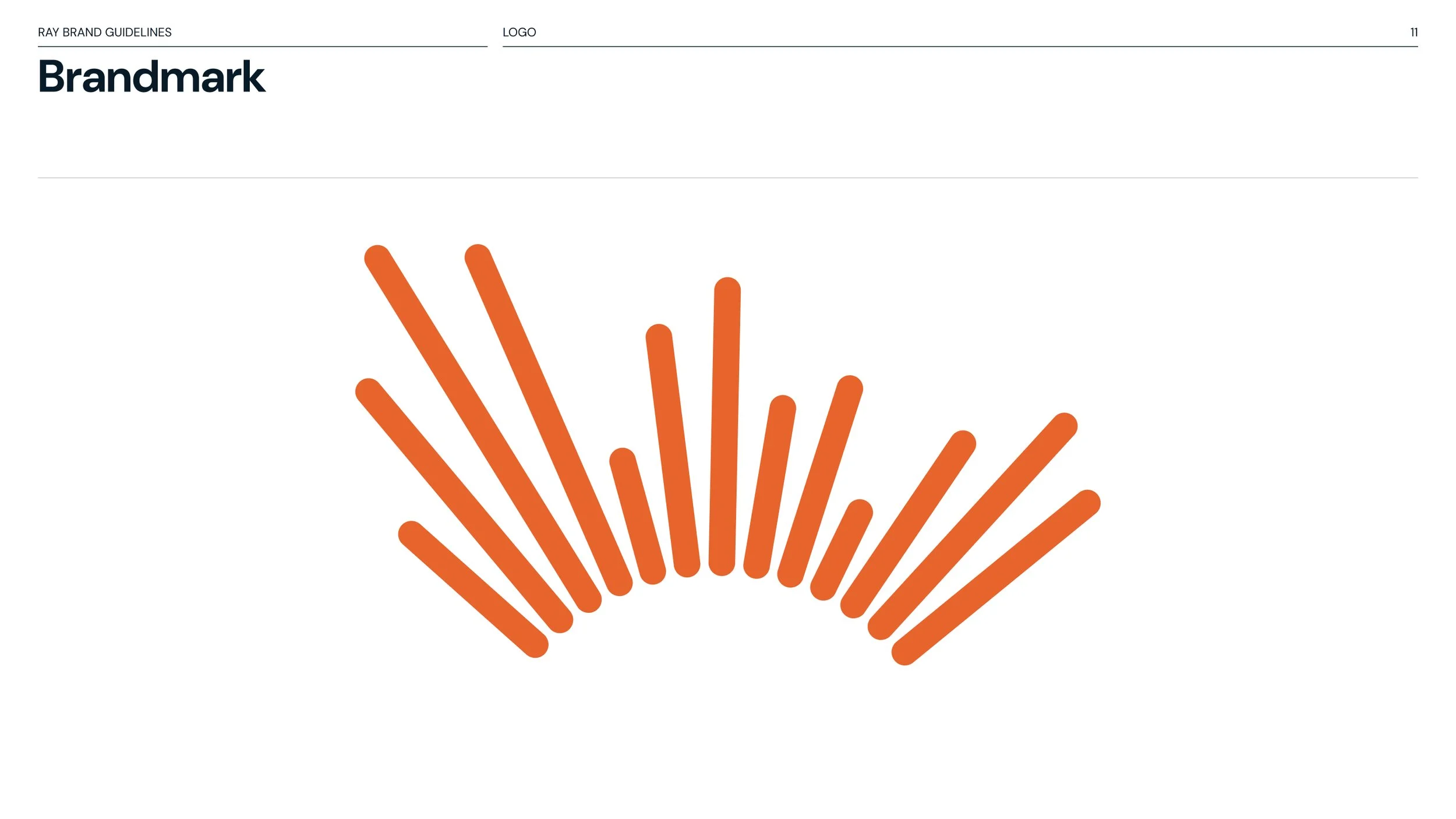
Designed a logo featuring rays of sunshine to symbolize new beginnings and self-reflection. The logo was refined through several iterations to ensure it conveyed both recording and listening functions effectively.
Creative Direction
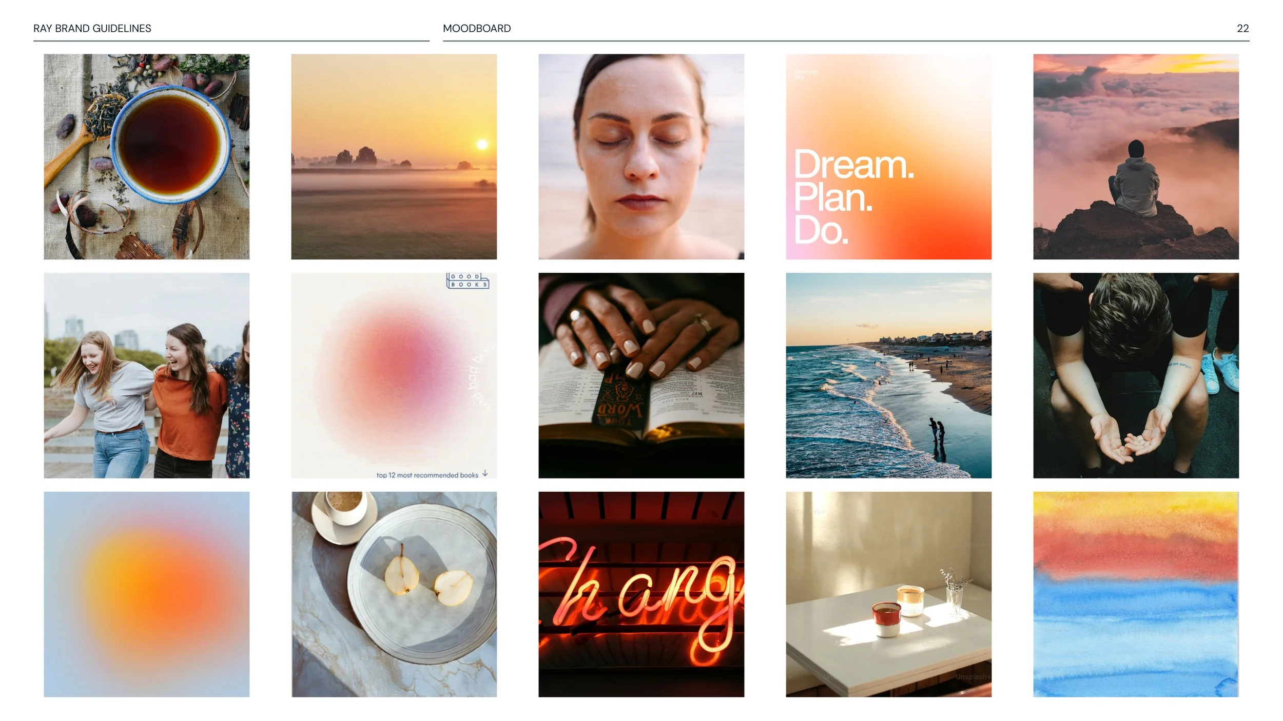
Crafted a visual direction that blends aspirational yet authentic photography with calming illustrations. The chosen photos reflect genuine, uplifting moments without being overly glossy, while the illustrations evoke serenity and peace. This approach ensures a cohesive and emotionally resonant experience that aligns with the app’s focus on self-care and positivity.
Tone of Voice
Crafted a tone of voice that is positive, hopeful, spiritual, down-to-earth, and friendly. Developed guidelines to ensure all written communication resonates with the brand’s values and enhances user engagement.
Color Palette
Developed a primary color palette inspired by sunrise and sunset—Tangerine, Peach Cream, Burnt Orange, and Cool Lavender. Created secondary and tertiary colors—Sunset Pink, Dark Midnight Blue, White, Clay, Vanilla Ice, and Serene Blue—to add depth and versatility while ensuring accessibility and alignment with the app’s tone.
Typography
Selected DM Sans for its legibility on mobile devices and neutral-positive emotional impact. Worked with the UX designer to establish a type hierarchy that enhances readability and user interaction on app screens.
Documentation
Developed a set of brand guidelines that encompass visual and verbal elements of the Ray app. This included detailed instructions for logo usage, color palette, typography, tone of voice, and imagery. The guidelines ensure consistency across all brand touchpoints, providing clear rules and examples to maintain a unified brand identity as the app expands and evolves.
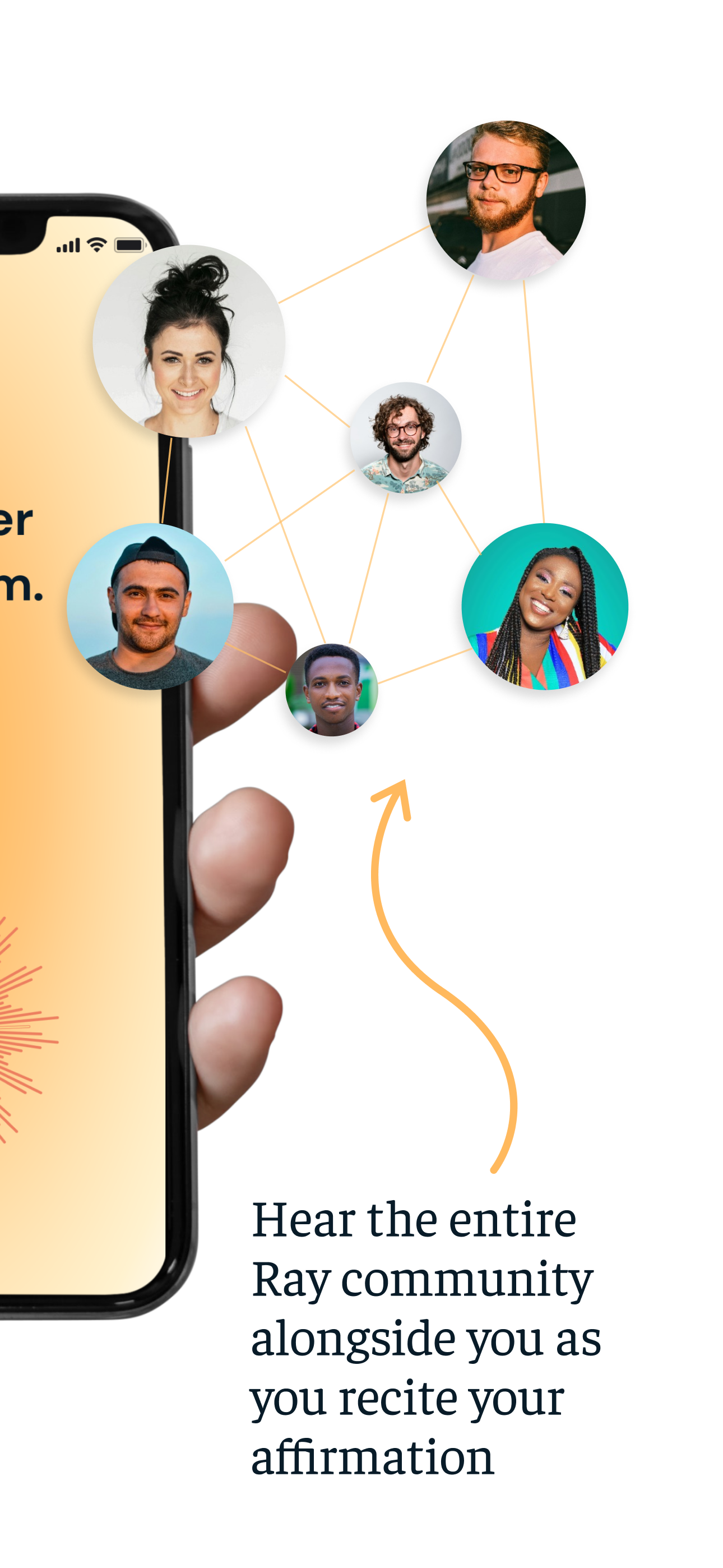
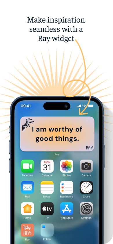
Preview screens for the Apple App Store
Record & Listen
The development of the record/listen button was a pivotal aspect of the Ray app’s interactive features. Faced with the challenge of creating a button that effectively represented both recording and playback functions, we embarked on an iterative design process. Initially, we explored various concepts, aiming to integrate the essence of Ray’s logo into a functional design. After six iterations, we arrived at the ultimate solution: a button that incorporates the rays from the logo, animated to resemble audio waves. This design not only conveys the dual functionality of recording and listening but also enhances user interaction through a visually engaging and intuitive interface. The final button seamlessly blends the app’s brand identity with its interactive elements, providing a cohesive and compelling user experience.
