A new onboarding flow
Branded product design | Interaction design

Project timeline
4 Weeks
TEAM
My contribution: Interaction Designer
Team of 6, including UX Researcher, 2 Developers, 2 Designers
the Challenge
My team as UST was contracted by British bank Vanquis Banking Group (VBG) to reimagine their entire consumer banking mobile app which was struggling to increase its adoption rate. With the target VBG customer being underserved in the banking sector, our clients saw this as an opportunity to drastically increase their consumer base. The current VBG mobile app required a high cognitive load from its users, and asked that they already have existing financial literacy. Our team’s first challenge was figuring out how we could create a customer onboarding process that would attract new customers and get them to adopt the app quickly.
insights
During our initial discovery phase we learned that the average VBG customer:
is an immigrant
is likely to have low or no credit history
speaks English as a second language
faces unexpected expenses on a regular basis
Meanwhile we also learned that over 80% of VBG’s existing customers user their phone for banking purposes.

Our goal
With the importance of proving speedy user adoption at the top of our minds, we made our goal with the onboarding flow to enable users to spend money through the app the same day as download.
Solution
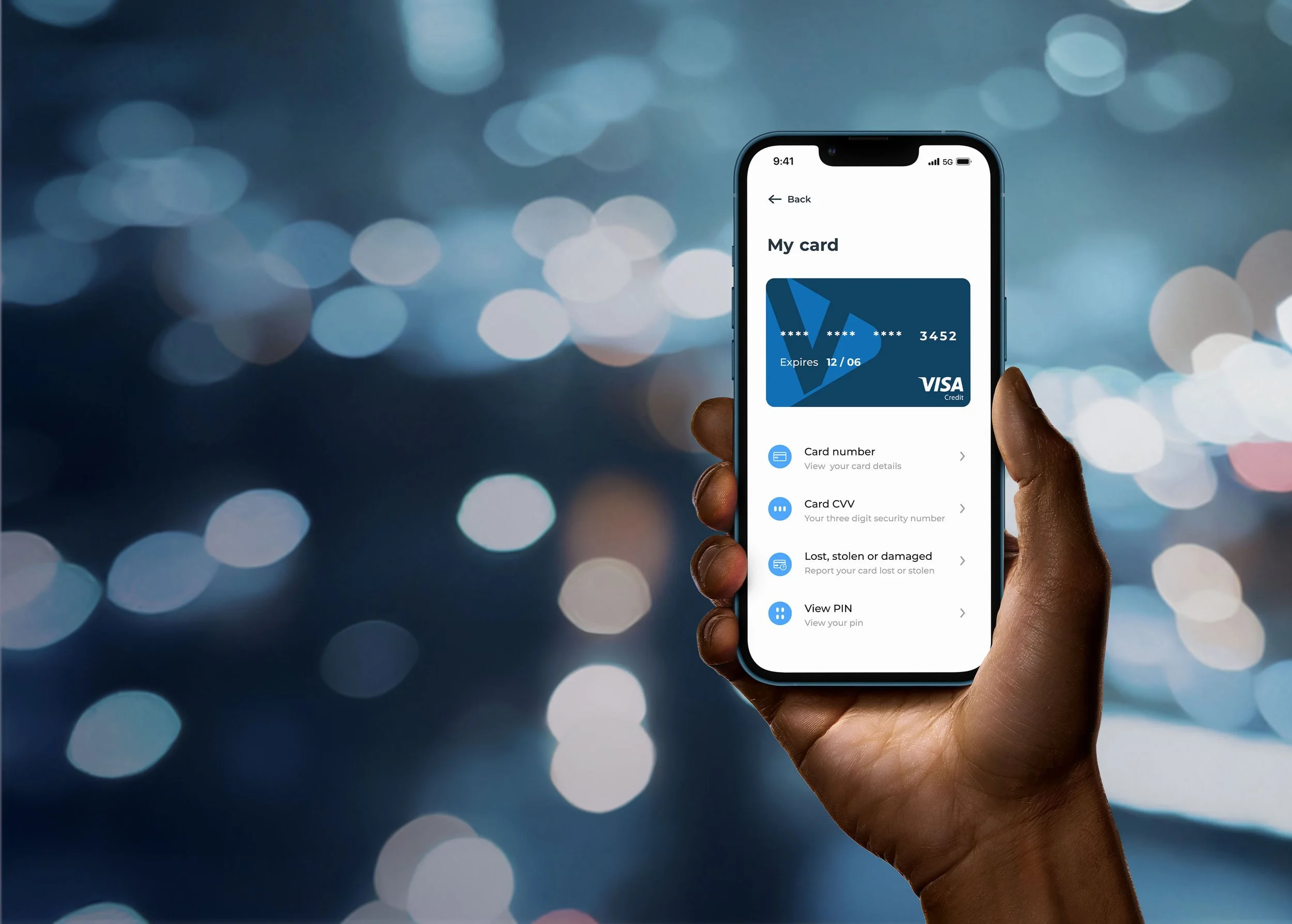
Our team focused on the insights we learned during discovery and designed a Proof of Concept with an onboarding process that would enable users to get immediate access to credit so they can start spending immediately. We established 8 high level requirements, including one that said customers need to be able to access their lending on the same day as application. This requirement told us we’d need to create a quick-access digital credit card that can be used with Google Pay.
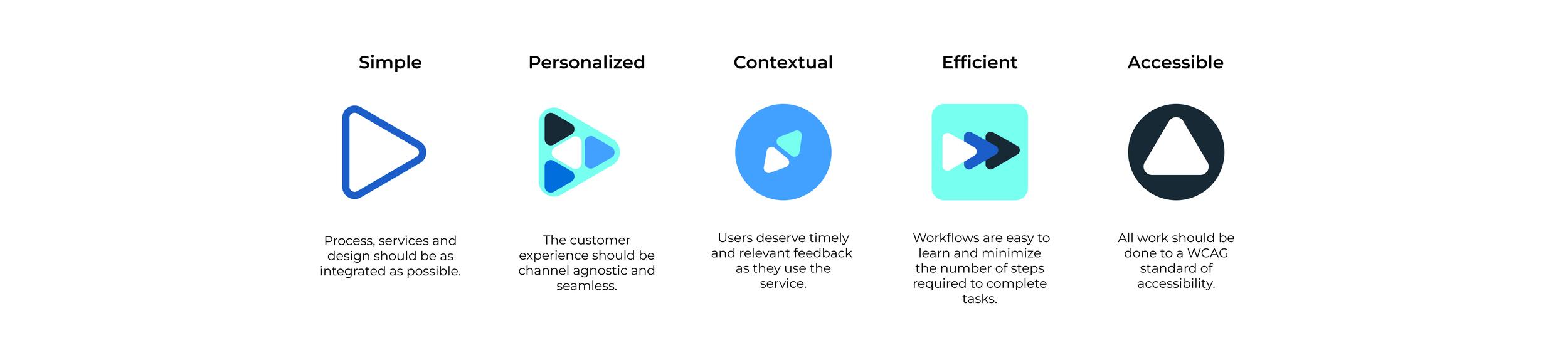
We agreed on a set of 5 design principles that would guide our work:
The first step in our POC solution was to create an onboarding carousel that would first and foremost tell users the biggest benefits of this app. We wanted to show users that this app was built with them in mind and can meaningfully add to their lives.
Our second step was to create the quick-card-access flow. In designing this flow, we prioritized speed, simplicity, and usability. We created a clear step-progress-bar that guides users through the process of applying for a credit card and lets them know “this is going to be simple.” We end this phase of the user journey by showing the new customer exactly how much they can spend right now, providing them the much needed access to credit they came looking for.

Informed by our onboarding user flow and our set of 5 design principles, we were able to create a comprehensive POC prototype that is now being user tested and expanded upon to create VBG’s new beta app.
